Why Your ChatGPT Posters Look Bad — And the Two-Prompt Fix
The short answer. Stop asking the image model to design the poster and write the words in the same message. Send two. The first prompt is pure art direction — format, material, composition, type system, colour, texture, restrictions — and ends by telling the model not to invent any copy yet. The second prompt contains only the exact words, in quotes, and nothing else. Art direction first. Text second.
Most people meet AI posters the same way. The design comes back looking almost right, then you actually read it: a misspelt headline, a date nobody asked for, three extra words floating in a corner, typography that belongs to no one. The instinct is to blame the model. Usually it's the brief.
A single poster prompt is really two jobs stacked on top of each other. Design the object. Then typeset copy inside that object, perfectly, first try. Ask for both in one breath and the model splits its attention and gives you half of each.
The two-stage approach below is adapted from Waviboy's Poster Laws, which sets the visual direction in one message and hands over the copy in the next. The prompts here are written from scratch for three jobs an Indian small business actually has: a run club, a community dinner and a cafe menu.
What breaks in a single prompt
Here is the prompt almost everyone writes:
Create a cool poster for a Sunday run club called Run Before Nine happening at Cubbon Park at 6:30 AM. Use bold typography, runners, orange and black colours, add the date, location, Instagram handle and the tagline Running is Better Together.
In that one sentence the model has to decide all of this at once:
- what the composition looks like and where the eye lands first
- which font style, at how many different sizes
- which colour dominates and which is an accent
- which words appear, spelled how, arranged where
- which details deserve attention and which get buried
So you get a good runner and ugly type. Or a clean layout with the wrong date. Or five text elements you never asked for. The fix is not a longer prompt. It's fewer decisions per prompt.
The two-prompt method
Prompt 1: build the visual system
The first message describes how the poster looks, not what it says. Write it like an art director briefing a designer: format, material, composition, type system, palette, texture, and a short list of things to avoid. Then close with the line that does the real work — do not create the final wording yet, hold this exact direction for the next prompt. You are building an empty visual system that is ready to receive information.
Prompt 2: lock the copy
The second message contains only the words. Every line in quotation marks. An instruction that nothing else may appear. An instruction not to rewrite, abbreviate or invent. And critically: do not describe the poster again. The visual language already exists. You are handing final copy to a designer who has already done the layout.
Six rules worth baking into every art direction prompt
These are the constraints that separate a poster from a template. They come out of Waviboy's Poster Laws, and they hold up across every brief we've run them on.
- Photography is the material. Ask for a real or archival photograph put through a physical treatment — cut out, duotoned, dithered, photocopied — rather than a 3D render. Type alone is allowed when the letterforms can carry the whole image.
- Two type sizes, nothing between. One enormous gesture and one tiny monospaced spec text. Mid-sized type is where amateur design lives.
- The layout performs the idea. A figure that dissolves as it repeats. A menu drawn as stops on a route. A word that echoes and fades. Describe the mechanism, not the mood.
- Small ephemera makes it real. A barcode, an edition code, a table number, a circular rubber stamp. Two or three of them, always tiny, always secondary.
- One loud flat colour carries it. Name the hex. Everything else is paper, ink and photo tones. Strict black on paper works too, as long as texture does the colour's job.
- It has to survive printing. Grain, scan noise, misregistration, creases. Ask for a scan of the printed thing, not a clean digital file.
A structure for prompt 1
If you want a reusable skeleton, fill in these eight slots and you have an art direction prompt: format (what are you making), visual material (photography, collage, archival, type-only), composition (where the eye goes first), typography system (the two scales), colour system (small, controlled, one hex), visual device (what makes it memorable), texture (screenprint, photocopy, offset, grain), restrictions (what the model must avoid).
Write the mechanism, not the mood
Adjectives give the model nothing to execute. Specific visual behaviour does.
Weak: make it feel fast and energetic.
Better: repeat the runner three times across the frame; the first is sharp, the second carries motion blur, the third dissolves almost completely into grain.
Weak: make it vintage.
Better: coarse halftone grain, slight ink misregistration, paper folds and visible photocopy noise.
Weak: use interesting typography and nice colours.
Better: one enormous condensed headline, everything else tiny monospace, black photography on warm cream paper with one fluorescent orange accent.
Prompt pair 1: the run club poster
Paste message 1 as is. Swap anything you want in message 2.
Message 1 — art direction
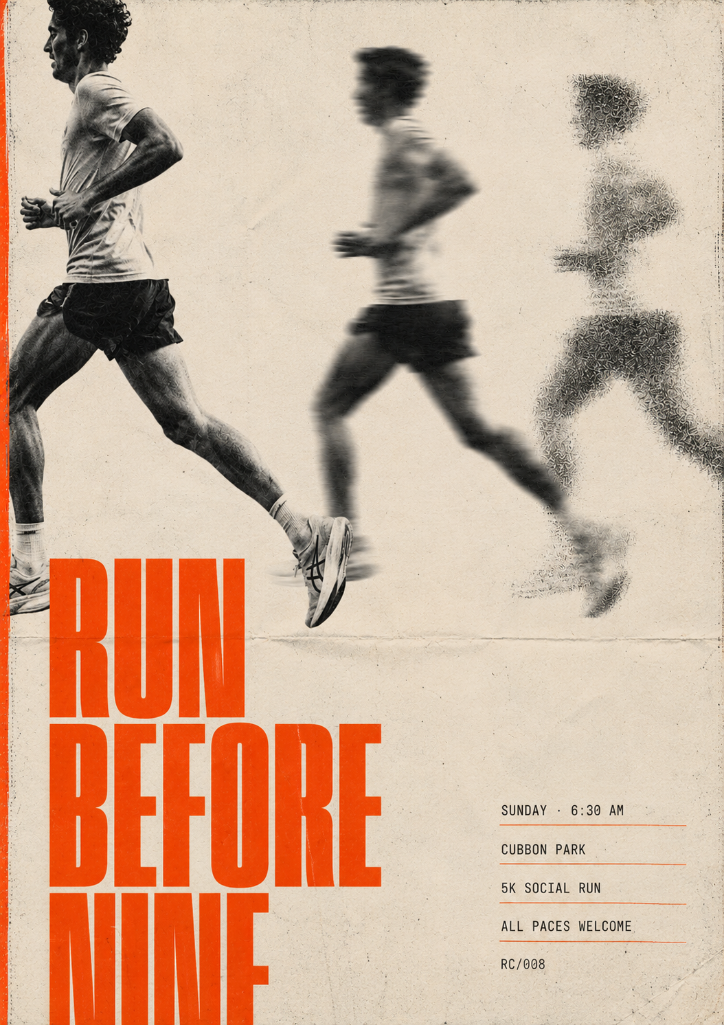
Create the art direction for a vertical A2 run-club poster, delivered as a flat frontal scan of the printed sheet, full bleed, no wall, no frame.

Use a single black-and-white documentary-style photograph of a runner captured mid-stride. Crop the runner dramatically so the body partially exits the frame. Repeat the runner three times moving from left to right: the first figure sharp, the second slightly motion-blurred, the third heavily degraded into grain, so the composition itself communicates movement.

Use warm off-white paper, near-black photography and one strong fluorescent orange accent. Typography has only two scales: one extremely large condensed sans-serif headline treatment, and very small monospaced functional information. Nothing in between. Keep large areas of negative space.

Add subtle physical print imperfections: film grain, ink misregistration, paper creases and scan texture. The finished result should feel like an independent running club poster that was physically printed and scanned, not a clean digital social-media template.

No sunrise imagery. No motivational stock-photo aesthetic. No gradients. No 3D text. No unnecessary icons.

Do not create the final wording yet. Hold this exact art direction for the next prompt.
Message 2 — exact copy
Use ONLY the following text:

"RUN BEFORE NINE"
"SUNDAY · 6:30 AM"
"CUBBON PARK"
"5K SOCIAL RUN"
"ALL PACES WELCOME"
"RC/008"

Do not add any other text. Keep every word, number and punctuation mark exactly as provided. Every letter crisp and correctly spelled.
Prompt pair 2: the community dinner
Community event posters go cluttered fast, because the single prompt carries food, people, date, time, venue, explanation and registration all at once. Make the central idea visual first, then hand over the details.
Message 1 — art direction
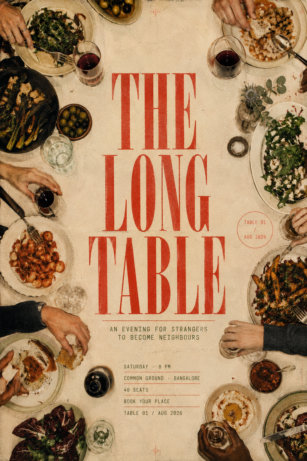
Create the art direction for a vertical community dining event poster, delivered as a flat frontal scan of the printed piece, full bleed, no wall, no frame.

Use an overhead editorial photograph of a long dining table seen directly from above. Different plates, glasses, bowls and hands enter naturally from the edges of the frame, suggesting strangers sharing one table. The centre of the table stays intentionally empty, forming a strong vertical negative-space corridor where the main typography will sit later.

Palette: warm cream, tomato red, olive green and natural food tones. The style should feel intimate, imperfect and human rather than luxurious restaurant advertising.

Only two typography scales exist: one oversized elegant serif gesture, and tiny monospaced event information. Nothing in between. Introduce subtle printed ephemera — a tiny table number, a reservation code, a small circular stamp — but keep them visually secondary.

Add gentle film grain, slightly faded colour reproduction, subtle paper texture and imperfect print registration.

No generic smiling stock-photo group. No floating food illustrations. No gradients. No glossy restaurant advertising aesthetic.

The idea should immediately communicate: different people, one shared table.

Do not insert the final event wording yet. Preserve this visual system for the next instruction.
Message 2 — exact copy
Use ONLY the following text:

"THE LONG TABLE"
"AN EVENING FOR STRANGERS TO BECOME NEIGHBOURS"
"SATURDAY · 8 PM"
"COMMON GROUND · BANGALORE"
"40 SEATS"
"BOOK YOUR PLACE"
"TABLE 01 / AUG 2026"

Do not create any additional copy. Every word must appear exactly as written.
Prompt pair 3: the coffee shop menu
Menus are the hardest test, because image models love inventing products, prices and spellings. So design the menu system first, then supply the menu.
Message 1 — art direction
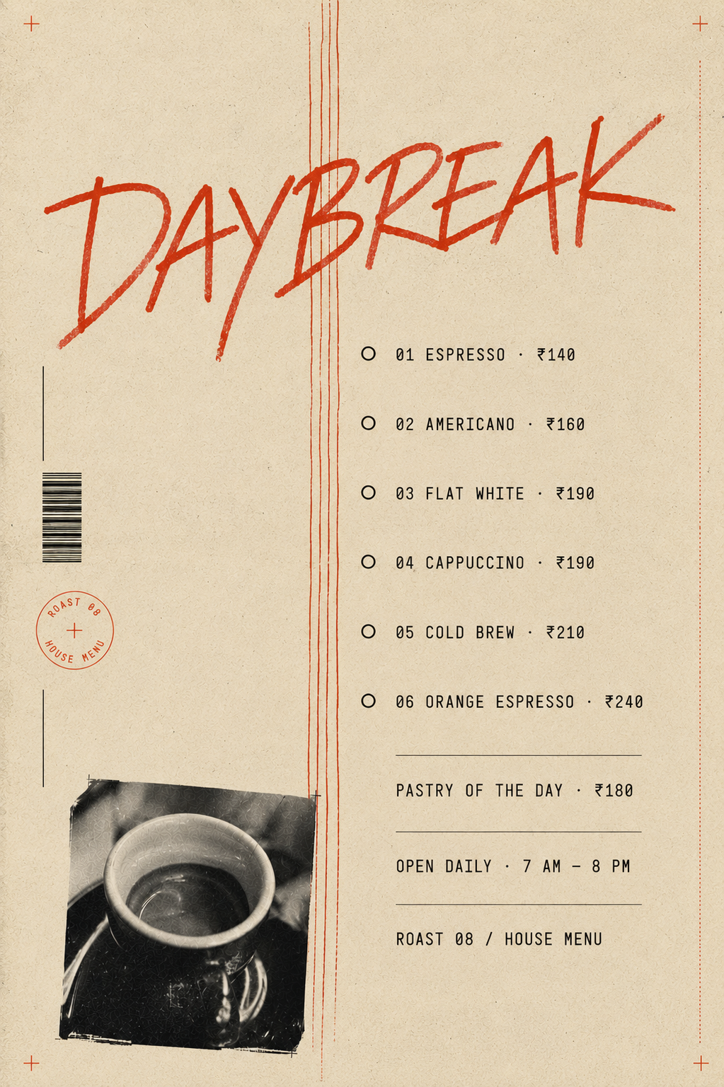
Create the art direction for a vertical specialty coffee-shop menu poster, delivered as a flat frontal scan of the printed piece. It should feel like a contemporary neighbourhood coffee bar, not a traditional restaurant menu.

Background: warm uncoated cream paper. Place one small documentary-style photograph of an espresso cup in the lower-left area, roughly cut out like an analogue editorial collage. From the cup, draw a thin hand-drawn line that travels vertically up the poster like steam. Use that steam line as the organising grid: individual drinks will later appear as numbered stops positioned along the route.

One oversized handwritten script wordmark crosses part of the composition. Everything else is tiny clean monospaced typography. No middle-sized type anywhere.

Palette: espresso brown, black and one loud tomato-red accent. Add subtle barcode-style details, a roast code and a small circular stamp as functional ephemera. Use visible paper fibres, subtle film grain, slight ink misregistration and a flattened print texture.

No coffee-bean clipart. No chalkboard aesthetic. No illustrated coffee cups. No gradients. No invented menu items.

Do not add product names or prices yet. Maintain this exact composition for the next prompt.
Message 2 — exact copy
Use ONLY the following text:

"DAYBREAK"
"01 ESPRESSO · ₹140"
"02 AMERICANO · ₹160"
"03 FLAT WHITE · ₹190"
"04 CAPPUCCINO · ₹190"
"05 COLD BREW · ₹210"
"06 ORANGE ESPRESSO · ₹240"
"PASTRY OF THE DAY · ₹180"
"OPEN DAILY · 7 AM — 8 PM"
"ROAST 08 / HOUSE MENU"

No other menu items. No additional prices. Do not change any spelling, numbers or punctuation.
The rule to remember
You don't need a 500-word master prompt every time you want a good poster. You need to separate the decisions. First prompt: tell the model how to design. Second prompt: tell it exactly what to write.
Once the system is in your head, the art direction changes but the method doesn't. Run clubs, product drops, gig flyers, workshop announcements, cafe promos, society notices, festival campaigns. Same two messages, different brief.
Never ask the model to solve the entire poster in one breath.
Quick summary · key points
- ✓What breaks in a single prompt
- ✓The two-prompt method
- ✓Prompt 1: build the visual system
- ✓Prompt 2: lock the copy
- ✓Six rules worth baking into every art direction prompt
- ✓A structure for prompt 1