Free Skill to Make a Custom Font With Claude

The short answer: add our free Font Designer skill to Claude, drop in a sketch or a reference image, and give the font a name. Claude studies the shapes, builds a full typeface, and hands you a TTF file plus a specimen sheet. Double-click the TTF, hit Install, and it shows up in Photoshop, Illustrator and PowerPoint.
A custom font used to mean hiring a type designer, learning a font editor, and waiting weeks. For most brands that was never worth it for a snack wrapper, a sticker run or a merch drop, so they picked a free font everyone else was already using.
Get the skill: download the free Font Designer skill here.
What the Font Designer skill does
A skill is a folder of instructions and scripts that teaches Claude to do one job well. This one turns Claude into a type designer. It never guesses at a style: it always starts from something you give it, reads it, decides how to build, and ships two files.
- A TTF font file: A to Z, 0 to 9 and core punctuation (. , ! ' - & ?), installable on Mac and Windows.
- A specimen sheet: a PNG showing every glyph and a few sample lines, so you can judge the font before installing it.
What you need
- Claude with skills and code execution turned on (Claude on the web or desktop, or Claude Code).
- A reference: a sketch, a photo of lettering, a logo, an alphabet sheet or a mood board. This is the one thing the skill will not start without.
- A name for your font. It gets baked into the file, so it is the name you will see in your design apps.
No font software, no Illustrator skills and no type design background.
Step 1: Add the skill to Claude
Download the Font Designer skill folder. It contains a ready font-designer.skill file, plus the source files if you want to look inside: the SKILL.md instructions, a style guide, and the Python scripts that do the drawing. Upload the .skill file in the Skills section of Claude's settings. In Claude Code, put the folder in your skills directory instead.
Step 2: Drop in your reference and ask for a font
Attach your image and write one line. For example:
Make me a font from this reference. Call it Choklet. I want it for chocolate packaging and merch.
Phrases like "make me a font", "build a typeface" or "turn this into a font" all trigger the skill. If you forget the image, Claude will ask for it and stop there.
Step 3: Claude reads the reference and picks an engine
Claude looks at the image like a designer would: how heavy the strokes are, whether thick and thin strokes contrast, how the ends finish (round, blunt, blobby), and any signature move such as drips or a rough edge. It states that read in two or three sentences, then makes one call.
- TRACE, when your image shows the actual letters. If you upload a full alphabet sheet or lettering sample, Claude crops out titles and decorations, finds each letter, maps it to A, B, C in reading order, and vectorizes the real outlines. Because it copies what is drawn, it handles any style: serif, script, chrome, pixel, blackletter, brush. Claude checks an overlay image showing which box became which letter before trusting the result.
- SYNTH, when your image shows a vibe. A sketch, a logo with a few letters, or a mood board is not a full alphabet. Here Claude builds every glyph from scratch on a rounded display skeleton and tunes it to match your reference. This is the path our Choklet wordmark took: seven letters in, a complete A to Z and 0 to 9 out.
Step 4: Review the specimen and tune it
For SYNTH fonts, Claude translates its read of your reference into a handful of dials. You never have to touch them, but knowing them makes feedback faster:
- Weight: how thick the strokes are, from thin to black.
- Swell: how much a stroke bulges and narrows. Zero looks mechanical, high looks poured and liquid.
- Wobble: how loose the line is. Raise it for a hand-drawn, marker feel.
- Terminals: round caps, flat cut ends, or blob ends that bead up like a droplet.
- Roughness: edge texture, for a stamped or grungy print look.
- Contrast: thin horizontals against thick verticals, for a brush or inky feel.
- Drips: honey or paint drips hanging off the low points of each letter, with a length you can scale.
A melted chocolate face like ours sits on the heavy liquid end: bold weight, plenty of swell, blob terminals and drips switched on. Then you just talk to it. "Drips are too long", "make it chunkier", "the G looks odd" all work. Claude nudges one or two dials and rebuilds in seconds. If a single letter looks awkward, it reshuffles that letter's organic randomness before changing anything else.
Step 5: Install it and use it anywhere
Download the TTF, double-click it and hit Install. It now appears in the font menu of Photoshop, Illustrator, PowerPoint, Canva desktop, Figma and anything else that reads system fonts. Type in lowercase or caps, both work, because lowercase is mapped to the capital letters, which is the right call for a display face.
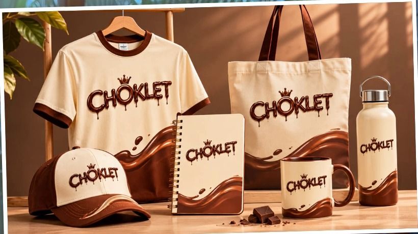
One thing worth knowing: a font file stores letter shapes, not colour. The glossy chocolate finish in our mockups is a layer style added in Photoshop on top of the font. The drips themselves are part of the letterforms, so they show up wherever you type.
Where brands can use a custom font
- Packaging: wrappers, labels and boxes with lettering no competitor can buy.
- Stickers and social: campaign headlines, reel captions and festive drops in a face that is recognisably yours.
- Merchandise: tees, caps, totes and mugs, where a one-off font does more for recall than a logo alone.
- Campaign lockups: a short-lived face for a product launch or a limited edition, without a type design budget.
Honest limits
- SYNTH makes rounded, upright display faces. It cannot invent true serifs, connected scripts or italics. If you want one of those, give it a reference that shows the full alphabet so it can use TRACE.
- TRACE is only as good as the image. A clean, high-contrast alphabet on a plain background gives a clean font. A blurry or busy photo gives a rough one.
- These are display fonts for headlines, packaging and merch. There is no kerning, hinting or extended language support, so for a retail-grade typeface treat the output as a strong first draft to refine in a font editor.
- Only trace lettering you own or have rights to. Tracing someone else's commercial font produces a copy of it, not an original.
FAQ
Can Claude really make a working font?
Yes. With the Font Designer skill, Claude runs Python scripts that draw each letter as vector outlines and pack them into a standard TrueType (.ttf) file. It installs and behaves like any font you would download.
Is the skill free?
Yes, the skill is free to download. You need a Claude plan that supports skills and code execution to run it.
Does it make lowercase letters?
By default lowercase keys type the capitals. If your reference sheet includes a drawn lowercase set, TRACE can build true lowercase letters from it.
How long does it take?
A first version comes back in a few minutes. Each round of tuning takes seconds, so most fonts are done in one sitting.
Get the Font Designer skill
Download the free skill here, drop in a sketch, and make a font that does not exist anywhere else. If you would rather have us build a full brand typeface and identity around it, that is what we do at Artea.
Quick summary · key points
- ✓What the Font Designer skill does
- ✓What you need
- ✓Step 1: Add the skill to Claude
- ✓Step 2: Drop in your reference and ask for a font
- ✓Step 3: Claude reads the reference and picks an engine
- ✓Step 4: Review the specimen and tune it