25 AI Prompts for Retro Print & Digital Photo Effects (2026)
There's a category of AI image prompt that isn't about turning your photo into a painting. It's about running it through a machine — a games console with 64 colors, a jammed office photocopier, a risograph drum, a thermal camera, a bootleg DVD press in 2003. The subject stays exactly where it was. Only the process that captured it changes.
These read differently from art-style prompts. A watercolor version of your product shot is decorative; a CMYK rosette version of it looks like it was printed somewhere real. That's why this family of effects keeps showing up in album art, merch, indie zines and streetwear campaigns — they carry the credibility of a physical process.
25 prompts below, grouped into four families: pixel and screen effects, print and press effects, material and surface effects, and instrument effects. Every one is written to sit on top of your existing photo rather than reinterpret it. Copy, attach your image, send.
How to use these prompts
One photo, one prompt, one generation. Each prompt already ends with an instruction telling the model to leave the subject, pose and composition alone — don't delete that line. It's the difference between your photo with an effect applied and a new photo that vaguely resembles yours.
These work in Gemini's Nano Banana Pro, ChatGPT's image model, and any tool that accepts a reference image. Texture-heavy effects like dithering, ASCII and halftone benefit from a high-contrast source photo — a flat, evenly lit image gives the dot pattern nothing to describe.
The first ten effects in this list were inspired by a roundup published by René Remsik at aitrendz.xyz. The prompts below are our own rewrites, expanded with the specific technical detail these models respond to.
Pixel & screen effects
1. 16-Bit Sprite
The half-step up from 8-bit: enough palette to keep a face readable, still obviously a game sprite. The sweet spot for profile pictures.
Rebuild this image as a 16-bit era console game sprite. Snap everything to a coarse pixel grid with flat, clearly visible square pixels, no anti-aliasing, and hard stair-stepped diagonals. Restrict the palette to roughly 32–64 saturated colors, use dithered pixel patterns rather than smooth gradients wherever shading is needed, and reduce facial and clothing detail to a few readable pixel clusters. Keep the subject, pose and composition exactly as in the original — apply the pixel-art style only, and do not add, remove or reposition anything.
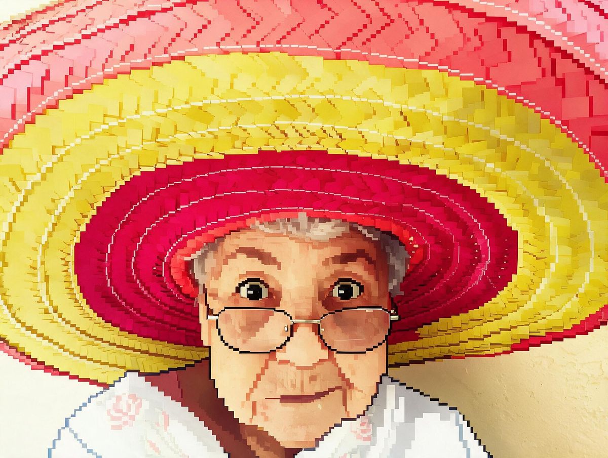
2. Fat Pixel
The same idea pushed until the image nearly falls apart. Use it when you want a shape and a color story, not a face — works well as a background or a loading-screen graphic.
Apply an extreme low-resolution pixelation to this image using oversized flat-color blocks, roughly 30–40 blocks across the full width. Each block must be a single solid color with no gradient inside it, edges must stair-step hard with no smoothing, and the total palette should collapse to around 12–16 colors. Let large areas merge into single flat shapes. Keep the subject, pose and composition exactly as in the original — apply the pixelation only, and do not add, remove or alter any elements.
3. Voxel 3D
Pixel logic in three dimensions — the subject rebuilt from stacked cubes with real shadows between them. Reads as playful and modern rather than nostalgic.
Rebuild this image as voxel 3D art constructed entirely from uniform cubes of equal size, stacked on a strict grid with no curved or angled surfaces anywhere. Give each cube a single flat color with subtle shading difference between its top, front and side faces, add soft ambient occlusion in the crevices where cubes meet, and light the whole thing with one soft overhead source. Keep the subject, pose and composition exactly as in the original — only rebuild it in voxels, and do not add or remove elements.
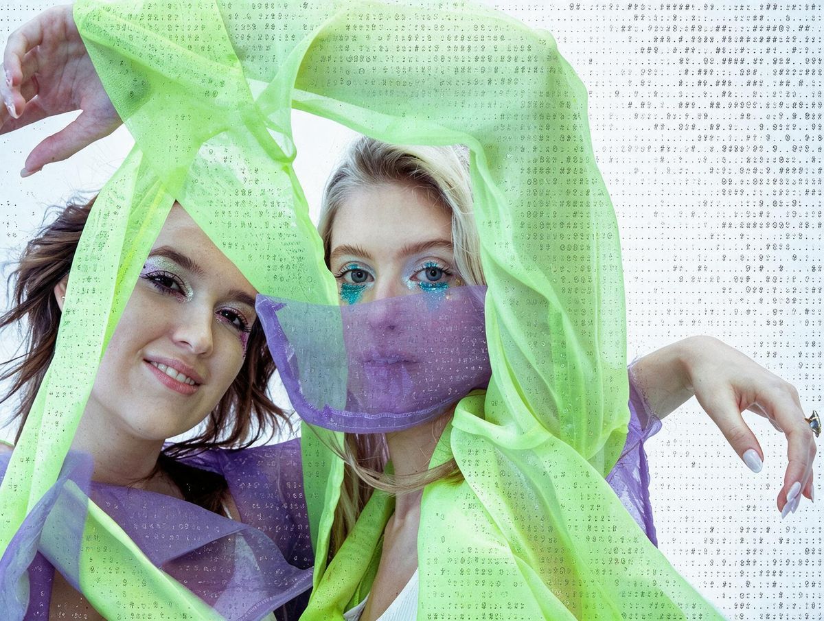
4. ASCII
Brightness mapped to text density — dense characters in the shadows, sparse in the highlights. Best on a photo with one strong, obvious silhouette.
Convert this image into ASCII text art. Replace the entire picture with a dense grid of monospaced characters, mapping tonal value to character weight — heavy glyphs like @, #, %, and & in the darkest areas, lighter ones like :, ., and ' in the highlights. Keep the characters aligned to a rigid monospace grid, use a single text color on a plain background, and make sure the subject stays clearly readable through the character texture. Keep the subject, pose and composition exactly as in the original — apply the ASCII conversion only.
5. Terminal
Green phosphor on black, the way a 1980s monitor rendered anything at all. Pairs naturally with the ASCII prompt if you want to stack two passes.
Render this image as an old green-phosphor CRT terminal display. Convert everything to a single green monochrome channel on a pure black background, build the tones from a dense stippled dot-matrix texture rather than continuous shading, add soft phosphor bloom around the brightest areas, faint horizontal scanlines across the whole frame, and slight glass curvature and vignetting at the corners. Keep the subject, pose and composition exactly as in the original — apply the display effect only.
6. Glitch / Datamosh
Controlled corruption. Keep it to a few bands — asking for heavy glitch across the whole frame destroys the subject and you lose the effect entirely.
Apply a digital glitch and datamosh effect to this image. Split the RGB channels so red and cyan fringe apart by a few pixels along high-contrast edges, displace three or four horizontal bands sideways as if the scan corrupted mid-frame, introduce visible JPEG macroblock artifacts and color smearing in those bands only, and leave the rest of the frame intact and sharp. Keep the subject, pose and composition exactly as in the original — apply the corruption effect on top, and do not redraw anything.
7. Anaglyph 3D
The red-and-cyan offset from paper 3D glasses. Subtle, cheap-looking in the best way, and instantly reads as retro cinema on a poster.
Apply a red-and-cyan anaglyph 3D effect to this image. Offset a red channel copy slightly to the left and a cyan copy slightly to the right, with larger separation on foreground elements and almost none in the far background so the depth reads correctly. Keep the underlying image sharp beneath the offset, and let the color fringing show clearly along edges. Keep the subject, pose and composition exactly as in the original — apply the anaglyph offset only.
Print & press effects
8. Bootleg Pixel
The pirated VCD cover look — blown-up low-res source, oversaturated ink, printed badly on cheap card. Deliberately ugly, and very effective on merch.
Make this image look like it was printed on a cheap bootleg VCD or DVD cover from the early 2000s. Push the colors warm and oversaturated with reds and yellows blooming past their edges, add a coarse visible dot and pixel texture as if a low-resolution file was scaled up too far, introduce generational-loss compression artifacts and slight color bleeding between adjacent areas, and finish with the flat matte look of cheap card stock. Keep the subject, pose and composition exactly as in the original — apply the print and color degradation only.
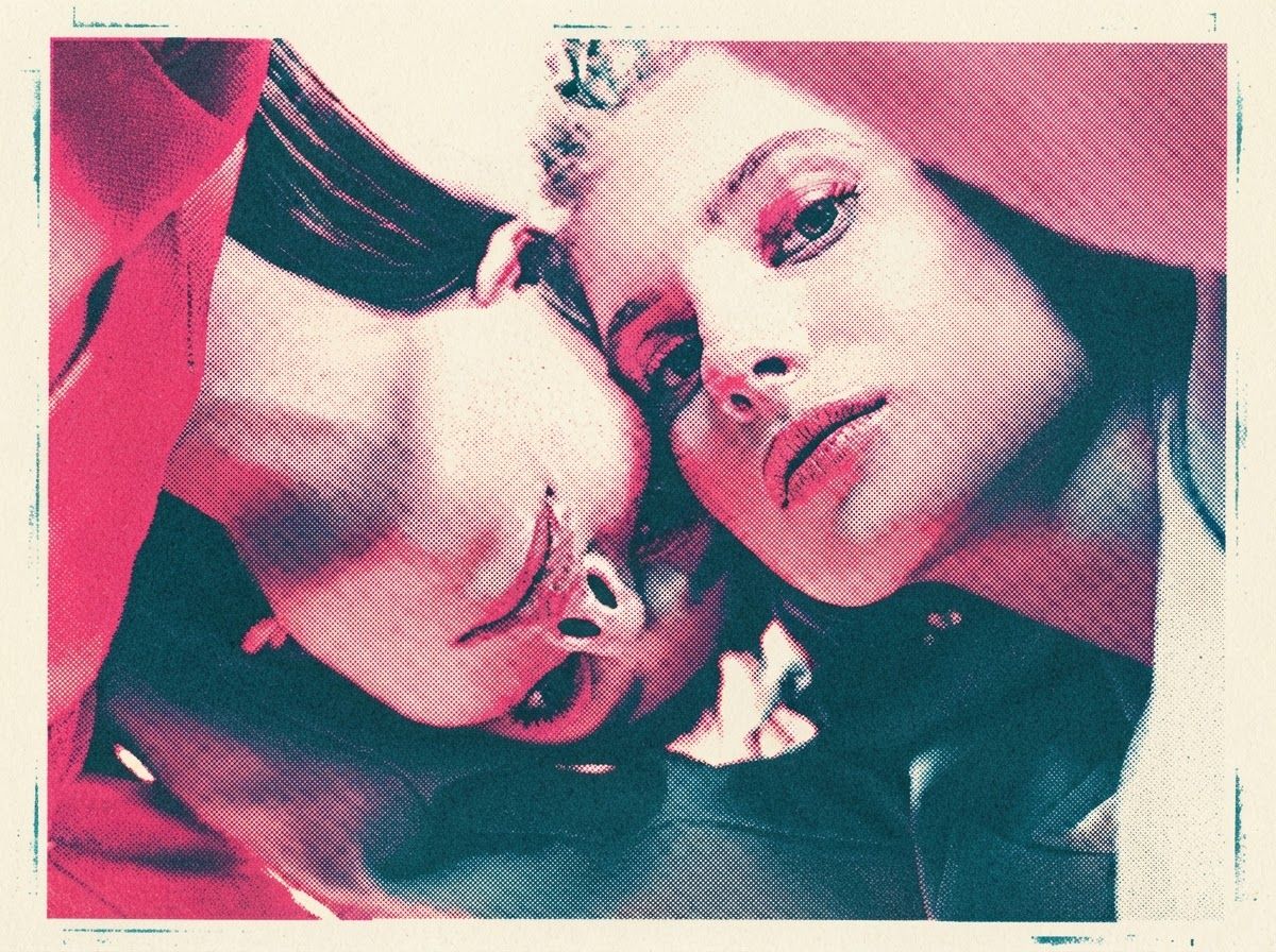
9. Risograph
The indie zine and gig poster staple. The teal-and-pink pairing is standard, but any two-ink combination works — swap in your brand colors and it stays convincing.
Print this image as a two-color risograph. Separate it into exactly two ink layers — teal and fluorescent hot pink — with the overlap areas producing a darker mixed tone. Offset the two layers a few millimetres so the registration is visibly imperfect, render both layers as coarse grainy halftone rather than solid fill, allow uneven ink coverage with faint streaking and a few unprinted specks, and let the warm off-white paper texture show through everywhere. Keep the subject, pose and composition exactly as in the original — apply the print process only.
10. 1-Bit Dither
Pure black and white, no grey anywhere — all the shading is an illusion built from dot spacing. The early Macintosh look, and the most technically demanding prompt here.
Convert this image to 1-bit black and white using Atkinson dithering. Use only pure black and pure white pixels — no greys, no anti-aliasing, no intermediate tones anywhere in the frame. Build every gradient and shadow purely from the spacing and clustering of black dots, keep the dither pattern fine and even, and preserve the crispness of the original edges. The result should look like an early Macintosh screen or a 1-bit scanned image. Keep the subject, pose and composition exactly as in the original — apply the dithering only.
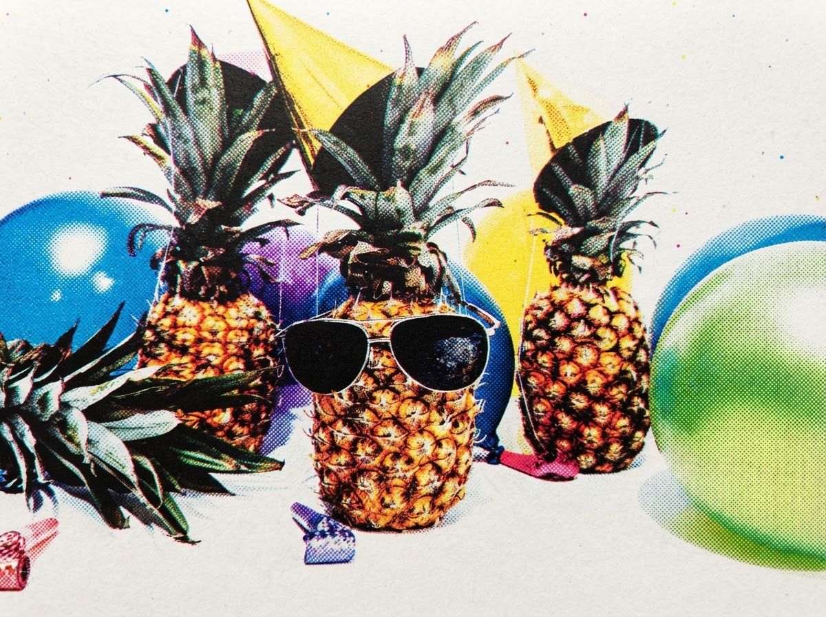
11. CMYK Dots
Zoomed-in offset printing, rosette pattern and all. The misregistration is what sells it — perfectly aligned dots just look like a filter.
Reproduce this image as a coarse CMYK offset print seen up close. Separate it into cyan, magenta, yellow and black halftone screens, each rotated to its own angle so the overlapping dots form a visible rosette pattern, make the dots large enough to read clearly at normal viewing distance, and offset one or two of the plates slightly so colored fringes appear along edges. Add faint newsprint paper texture and slight ink dot gain. Keep the subject, pose and composition exactly as in the original — apply the print separation only.
12. Halftone Print
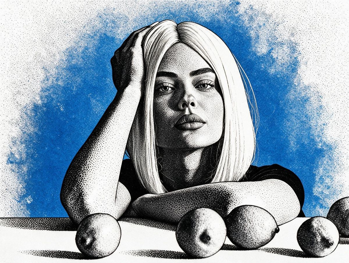
One ink, maximum contrast, a single glowing color behind. The most poster-ready effect on this list — it leaves clean space for type.
Turn this image into a high-contrast single-ink halftone print. Crush the tonal range so midtones collapse toward pure black or white, render all remaining shading as dense black halftone dots that grow and shrink with tone, and place the subject against a saturated electric blue background that bleeds softly outward behind the edges as if the ink were glowing. Keep the dot grid regular and clearly visible. Keep the subject, pose and composition exactly as in the original — apply the halftone treatment only.
13. Punk Collage
Photocopied, cut out, taped down, drawn on. The one effect here that adds something around your photo rather than only to it.
Make this image the centrepiece of a punk zine collage. Render the photo itself as a harsh black-and-white photocopy with blown-out highlights, blocked-up shadows and coarse halftone dots, then treat it as a piece of paper roughly cut out with torn edges and taped down onto a flat hot-pink background. Add scrawled marker doodles, scratchy hand-drawn arrows and scribbled borders around the outside of the photo. Keep the main subject, pose and composition exactly as in the original — the collage elements go around it, never over the subject's face.
14. Three-Color Screen Print
How a t-shirt or gig poster actually gets made — three separated ink layers, nothing in between. Useful when the output has to go to a real printer later.
Separate this image into a three-color screen print. Reduce the entire picture to exactly three flat spot colors plus the paper — no gradients, no blending, hard edges between every color area. Build the mid-tones from coarse dot or line screens where two inks overlap, add slight registration drift between the layers, and give the ink a matte, slightly uneven texture as if pulled by hand through a screen. Keep the subject, pose and composition exactly as in the original — apply the color separation only.
15. Letterpress Deboss
Quiet and expensive-looking. The whole effect lives in the raking light and the shadow inside the impression — say both explicitly or you get flat printed paper.
Render this image as a letterpress impression on thick cotton paper. Simplify it to bold, simplified shapes in a single ink color, then press those shapes physically into the paper so each one sits in a visible recess with a soft shadow along one inner edge and a faint highlight along the other. Light the sheet from a low raking angle so the depth of the impression is unmistakable, and show the deckled edge and cotton fibre texture of the stock. Keep the subject, pose and composition exactly as in the original — apply the letterpress treatment only.
16. Copperplate Engraving
The stipple-and-hatch portrait style from old newspapers and banknotes. Holds a likeness better than any other effect here — good for founder headshots and bylines.
Convert this image into a copperplate engraving in the style of a newspaper portrait or banknote illustration. Build every tone from fine parallel hatching, cross-hatching and stipple dots in black ink on cream paper — no solid black fills and no continuous tone anywhere. Let the hatching lines follow the contours of the form so they describe the shape as they shade it, vary line weight to create depth, and leave the brightest areas as bare paper. Keep the subject, pose and composition exactly as in the original — apply the engraving technique only.
17. Cyanotype Blueprint
White linework on Prussian blue. Made for products and architecture rather than people — it reframes an object as something engineered.
Redraw this image as a technical cyanotype blueprint. Render the subject as clean white line drawing on a deep Prussian blue ground, using outline and construction lines only with light hatching for the shaded planes. Add a faint white measurement grid across the background, a few thin dimension lines with arrowheads at the edges of the subject, and subtle blotching and edge fading as if the blueprint paper had aged unevenly. Keep the subject, pose and composition exactly as in the original — apply the blueprint treatment only.
Material & surface effects
18. Holographic Foil
Trading-card iridescence. The shift has to follow the form rather than sit flat across it — that's the instruction most people miss.
Render this image as a holographic foil stamp on a card. Convert the subject into reflective metallic foil whose color shifts across the spectrum — magenta into cyan into gold into green — with the shift following the contours of the form rather than running flat across the frame. Add fine linear diffraction streaks catching the light, sharp specular hotspots on the raised areas, and a slightly embossed edge where the foil meets the matte card stock underneath. Keep the subject, pose and composition exactly as in the original — apply the foil treatment only.
19. Liquid Chrome
The Y2K chrome revival that refuses to die. Best on simple, bold forms — fine detail disappears into the reflections.
Recast this image as polished liquid chrome. Convert every surface into mirror-finish metal with softened, molten-looking edges, reflecting an unseen environment as smeared bands of light and dark with a cool blue horizon line and a warm highlight above it. Add sharp specular hotspots on the high points, deep near-black reflections in the recesses, and a subtle rainbow fringe where the chrome curves away. Place it on a plain gradient background. Keep the subject, pose and composition exactly as in the original — apply the chrome material only.
20. Embroidered Patch
Turns any logo or mascot into merch you can almost feel. The merrowed border is the detail that makes it read as a real patch instead of a texture filter.
Render this image as an embroidered patch. Simplify it into bold flat color areas filled with dense satin stitching, with the stitch direction changing between adjacent areas so the thread sheen catches light differently in each one. Outline every shape in tight raised stitching, finish the whole patch with a thick merrowed rope border, add slight puckering where the thread pulls the felt backing, and show individual thread fibres at the edges. Keep the subject, pose and composition exactly as in the original — apply the embroidery treatment only.
21. Die-Cut Sticker
Thick white border, glossy vinyl, slight lift at one corner. Instantly usable as a Story sticker, a Notion cover or actual printed merch.
Turn this image into a die-cut vinyl sticker. Simplify the artwork into bold shapes with clean edges, surround the whole subject with a thick even white border that follows its outer silhouette, give the surface a glossy vinyl finish with a soft specular sheen across it, curl one corner very slightly away from the surface, and cast a small soft drop shadow beneath. Place it on a plain flat background. Keep the subject, pose and composition exactly as in the original — apply the sticker treatment only.
Instrument & camera effects
22. Thermal Camera
Heat mapped to color, not brightness. Works best on living subjects and machinery — anything with a plausible reason to be warm.
Render this image as a thermal infrared camera capture. Map surface temperature to color rather than brightness — white and yellow at the hottest points, through orange and magenta, into deep purple and black at the coolest. Make warm-blooded subjects glow brightest at the face and hands, keep background surfaces cool and dark, blur the fine detail slightly the way a low-resolution thermal sensor does, and add a small temperature scale bar along one edge. Keep the subject, pose and composition exactly as in the original — apply the thermal mapping only.
23. X-Ray
The see-through version. Strongest on objects — a shoe, a camera, a plant — where the internal structure is the surprise.
Render this image as an X-ray radiograph. Make every surface semi-transparent, with density determining brightness — dense internal structures glowing bright white, softer material rendered as translucent grey, and empty space falling to black. Let overlapping forms visibly stack and brighten where they cross, keep edges slightly soft and glowing rather than sharp, and add faint radiographic film grain across the frame. Keep the subject, pose and composition exactly as in the original — apply the X-ray rendering only.
24. Topographic Contour
The subject redrawn as an elevation map, with depth as height. Reliably good for abstract hero images and section dividers.
Redraw this image as a topographic contour map, treating the depth of the scene as elevation. Replace all surfaces with evenly spaced contour lines that trace each level of the form — tightly bunched where the surface changes steeply, widely spaced across flat areas. Use fine lines in a single color on a plain contrasting ground, thicken every fifth contour as an index line, and add nothing else. Keep the subject, pose and composition exactly as in the original — apply the contour mapping only.
25. Polaroid Instant Film
The gentlest effect on the list. Faces stay fully intact, so use it when the person still has to be recognisably themselves.
Make this image look like an instant film photograph from a 1970s Polaroid camera. Frame it as a square print inside the classic white plastic border with the wide margin along the bottom, shift the colors warm with milky lifted blacks and slightly crushed highlights, add a soft chemical bloom where bright areas bleed outward, keep the focus gently soft with a mild center-weighted falloff, and add faint uneven development mottling. Keep the subject, pose and composition exactly as in the original — apply the film treatment only.
Tips for Better Results
Never drop the lock line. Every prompt here ends with an instruction to leave the subject, pose and composition untouched. It's there because these models default to reinterpreting rather than processing — remove it and you'll get a different person in a risograph style instead of your person, risographed. If the model still drifts, escalate: "do not redraw the subject, this is a texture pass only."
Dial the intensity in the next message, not the prompt. "Make the pixel blocks larger." "Fewer colors." "Reduce the dot density by half." "Less glitch, keep it to two bands." The model still has the original prompt in context, so a one-line correction is faster and safer than a rewrite.
Stack effects in two passes. Run the ASCII prompt, then feed that output back in with the terminal prompt for a layered retro-computer look. Halftone into punk collage. Screen print into letterpress. Two sequential passes build genuine depth; merging both into one prompt averages them into nothing.
Contrast in, texture out. Dithering, ASCII, halftone and engraving all work by translating tonal range into pattern. A flat, evenly lit source photo has no range to translate, so the output comes back muddy. Boost contrast on the original before you upload it — it does more than any prompt tweak.
Match the effect to how much face you need. Polaroid, copperplate engraving and anaglyph keep a person recognisable. Fat pixel, voxel, ASCII and topographic contour deliberately dissolve them. Client-facing headshots belong in the first group.
Swap in your brand colors. Risograph, three-color screen print, halftone and cyanotype all name specific inks. Replace them with your own and the process still reads as authentic — it's the misregistration, grain and dot structure doing the work, not the particular hue.
Regenerate instead of arguing. Three failed corrections on the same output means the model has committed to a bad reading. A fresh generation from the same prompt is faster than a fourth attempt at talking it out of one.
Where this actually gets used
Process effects earn their keep in places art styles can't go. A product shot as a cyanotype blueprint makes a credible spec-sheet graphic. A founder photo as a copperplate engraving works as a byline portrait that doesn't look like everyone else's headshot. One campaign image through risograph, screen print and halftone gives you three variants that look like they came from a print run rather than a filter menu. And embroidered patch, die-cut sticker and foil are effectively free merch mockups — you can show a client the idea before anything gets manufactured.
Pick one effect, apply it across a month of posts, and the feed stops looking assembled. That consistency is worth more than any individual prompt on this page.
Quick summary · key points
- ✓How to use these prompts
- ✓Pixel & screen effects
- ✓1. 16-Bit Sprite
- ✓2. Fat Pixel
- ✓3. Voxel 3D
- ✓4. ASCII