25 AI Prompts to Turn Any Photo Into Art | Copy-Paste Ready

Any decent image model can restyle a photo you already have — same face, same pose, same framing, rendered as a watercolor, a woodblock print, or a stop-motion clay figure. The catch is that a two-word prompt gets you a two-word result. Type "make this a watercolor" and you get the same soft blue-grey mush everyone else gets, because the model is filling in every decision you didn't make.
The 25 prompts below are written the way an art director briefs an illustrator: naming the surface, the light source, the palette, the brushwork, and the small physical tells that make each medium read as real — pigment granulation in watercolor, craquelure in old oil, fingerprint marks in clay, misregistered ink in a comic print. Copy the one you want, attach your photo, send. They work in Gemini's Nano Banana Pro, ChatGPT's image model, Midjourney image-to-image, and anything else that accepts a reference photo.
How to use these prompts
Upload one photo, paste one prompt, generate. Don't attach three reference images and don't combine two styles in the first pass — the model averages them and you lose both.
Add this line to the end of any prompt here: "Keep the subject, pose, framing and composition exactly as they are in the reference photo — change only the rendering style." Every prompt below describes a style, not a scene. Without that instruction, most models treat your photo as loose inspiration and quietly redraw the whole thing.
Everything after the style name is editable. Swap the palette, the light direction, the era — the structure of the prompt is what's doing the work, not any single adjective in it.
1. Watercolor Illustration
The safest bet for portraits, family photos and wedding shots. Forgiving on faces because soft edges read as intentional rather than as an AI mistake.
Transform this photo into a watercolor painting on cold-press paper. Use soft, translucent washes with visible pigment granulation, gentle color bleeds and feathered edges where wet colors meet, and loose, confident brushwork that leaves some areas underpainted. Keep skin and key details soft-focus but recognizable, use a light, airy palette with warm highlights and cool shadow washes, and let a few controlled drips run from the darker areas.
2. Classical Oil Painting
Best on a single subject against a plain background. The dark backdrop and single light source do most of the heavy lifting, so busy photos fight the style.
Reimagine this photo as a classical oil painting in the style of a 17th-century portrait. Use visible canvas weave texture, thick impasto brushstrokes in the highlights and thinner glazes in the shadows, warm chiaroscuro lighting with one dominant light source, a dark neutral background, and a rich, muted palette of ochres, umbers, and deep reds. Add subtle craquelure texture as if the painting has aged.
3. Origami Paper Fold
Excellent for product shots and minimal brand visuals. The three-color limit makes it easy to force into your brand palette.
Convert this photo into an origami-style illustration built entirely from folded paper planes — no curves, only straight creases and flat triangular or polygonal facets. Use a matte, slightly textured paper surface, soft directional studio lighting that catches each fold's edge, subtle drop shadows between overlapping planes, and a restrained two- or three-color palette (e.g. white, blush, and gold) against a plain background.
4. Cyberpunk Neon
Works hardest on photos that already have some depth behind the subject — a street, a doorway, a window. Flat studio backgrounds leave the skyline with nothing to attach to.
Turn this photo into a cyberpunk night scene. Light the subject with glowing neon signage in magenta, cyan, and violet, add strong rim lighting that separates the subject from a dark background, include rain-slicked reflective surfaces on the ground and wet highlights on skin or clothing, layer in soft atmospheric haze and lens flare from distant signs, and set it against a dense, foggy futuristic skyline.
5. Studio-Ghibli-Inspired Anime
The one that goes viral every few months. Travel photos and outdoor shots convert best — the painterly backgrounds need something to paint.
Restyle this photo as a hand-drawn Japanese animation still. Use soft two-tone cel shading with warm and cool shadow variants, painterly watercolor-style backgrounds with visible brushwork, clean expressive linework on the subject, warm late-afternoon lighting with soft bloom, and a gentle, nostalgic color grade leaning toward warm ambers and soft greens.
6. Claymation
Great for mascots, team photos and anything meant to feel warm rather than slick. The shallow depth of field is what sells the tabletop scale — keep it in.
Transform this photo into a stop-motion claymation character. Give it rounded, slightly asymmetric clay forms, visible sculpting texture and fingerprint marks in the clay, a matte non-reflective surface, subtle seams where clay pieces join, and warm three-point studio lighting typical of a miniature model set, with a shallow depth of field to sell the tabletop scale.
7. 8-Bit Pixel Art
Simplifies faces down to almost nothing, which is a feature — use it when you want a recognizable silhouette without a recognizable person.
Convert this photo into 8-bit pixel art in the style of a 1990s console game sprite. Use a strict limited palette (16–32 colors), visible chunky square pixels with no anti-aliasing, hard geometric edges, simplified facial and clothing detail reduced to essential shapes, and a flat, evenly lit color scheme with minimal gradient banding.
8. Pop Art
Built for feed stopping power. Needs a high-contrast source photo — soft, evenly lit images collapse into flat color with nothing to separate.
Restyle this photo in a bold Warhol-style pop-art print. Use thick black ink outlines, flat saturated color blocks in unexpected combinations (hot pink, cyan, yellow), visible Ben-Day halftone dot shading in the midtones, high-contrast lighting with no soft gradients, and a plain bold-colored background — treat it like a silkscreen print with slightly offset color registration.
9. Ink Line Art
The most reusable output on this list — black on white drops straight into a logo lockup, a menu, a packaging insert or a tattoo reference without any further editing.
Turn this photo into a hand-drawn ink illustration using only black lines on white — no color, no gray fill. Use varying line weight (thicker outer contours, finer interior detail), minimal cross-hatching only in the deepest shadows, smooth confident single-stroke linework rather than sketchy repeated lines, and leave open, unshaded negative space to keep it feeling light.
10. Vintage 90s Film Photograph
Barely a style change, which is the point. Faces stay intact, so it's the one to use when the person in the photo still has to look like themselves.
Give this photo the look of a 1990s point-and-shoot film camera. Add visible film grain, a slightly warm and muted color cast (faded reds, soft yellows), gentle vignetting at the corners, soft sun flare or a light leak streak across one edge, mild motion blur if there's movement, and the slightly soft, imperfect focus typical of consumer film cameras from that era.
11. Gothic Dark Fantasy
Book covers, event posters, anything that needs weight. The "ancient and moody rather than cartoonish" instruction is what keeps it from sliding into Halloween clip art — don't cut it.
Reimagine this photo in a gothic dark-fantasy style. Use dramatic low-key lighting with a single hard light source carving out strong shadows, a cool desaturated palette (charcoal, deep blue, muted crimson), ornate architectural or textile details worked into the shadows, fog or dust particles catching the light, and an overall atmosphere that feels ancient and moody rather than cartoonish.
12. Stained Glass
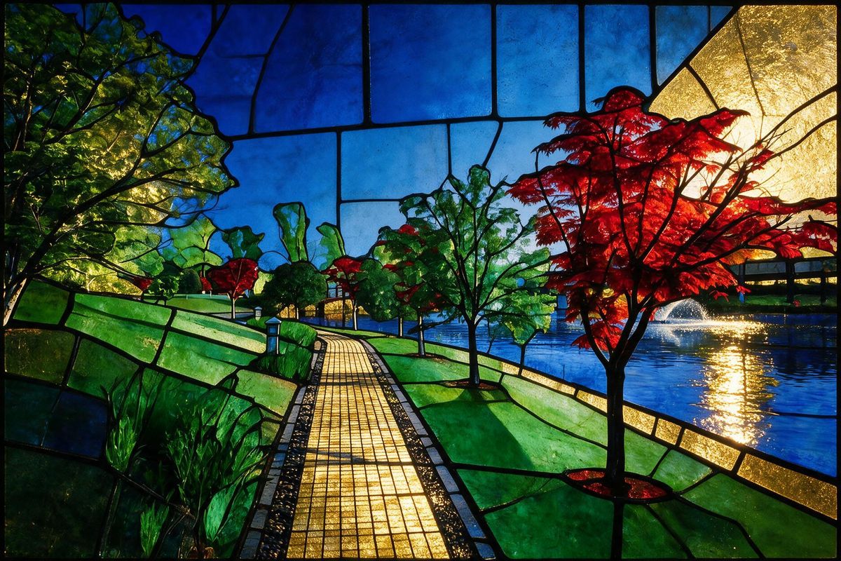
Needs a bold, simple shape to divide up. Portraits and single objects work; crowded group photos turn into a mess of leadlines.
Convert this photo into a stained-glass window design. Divide the image into clearly defined sections separated by bold black leadlines, fill each section with a single flat jewel-toned color (deep blue, ruby, emerald, gold), simulate backlighting so the color panels appear to glow, and add subtle texture variation within each glass panel as real stained glass would have.
13. Ukiyo-e Woodblock Print
Landscapes, water, weather, mountains — anything with layered depth. The flattened composition instruction is doing real work here, so keep the framing note in your prompt.
Restyle this photo as a traditional Japanese ukiyo-e woodblock print. Use flat, layered blocks of color with no gradients, clean bold black outlines with slight linework imperfections typical of hand-carved blocks, a muted traditional palette (indigo, ochre, muted red), visible woodgrain and paper texture, and a slightly asymmetric, flattened composition in the style of Hokusai or Hiroshige.
14. Comic Book Halftone
Leaves natural space for a caption box or speech bubble, which makes it the easiest style here to turn into an actual ad creative.
Turn this photo into a printed comic book panel. Use bold black ink outlines with dynamic thick-to-thin line variation, vibrant halftone dot shading in the midtones and shadows, punchy primary and secondary colors, hard directional lighting that creates strong graphic shapes, and a subtle printed-paper texture with slight color misregistration at the edges.
15. Isometric Diorama
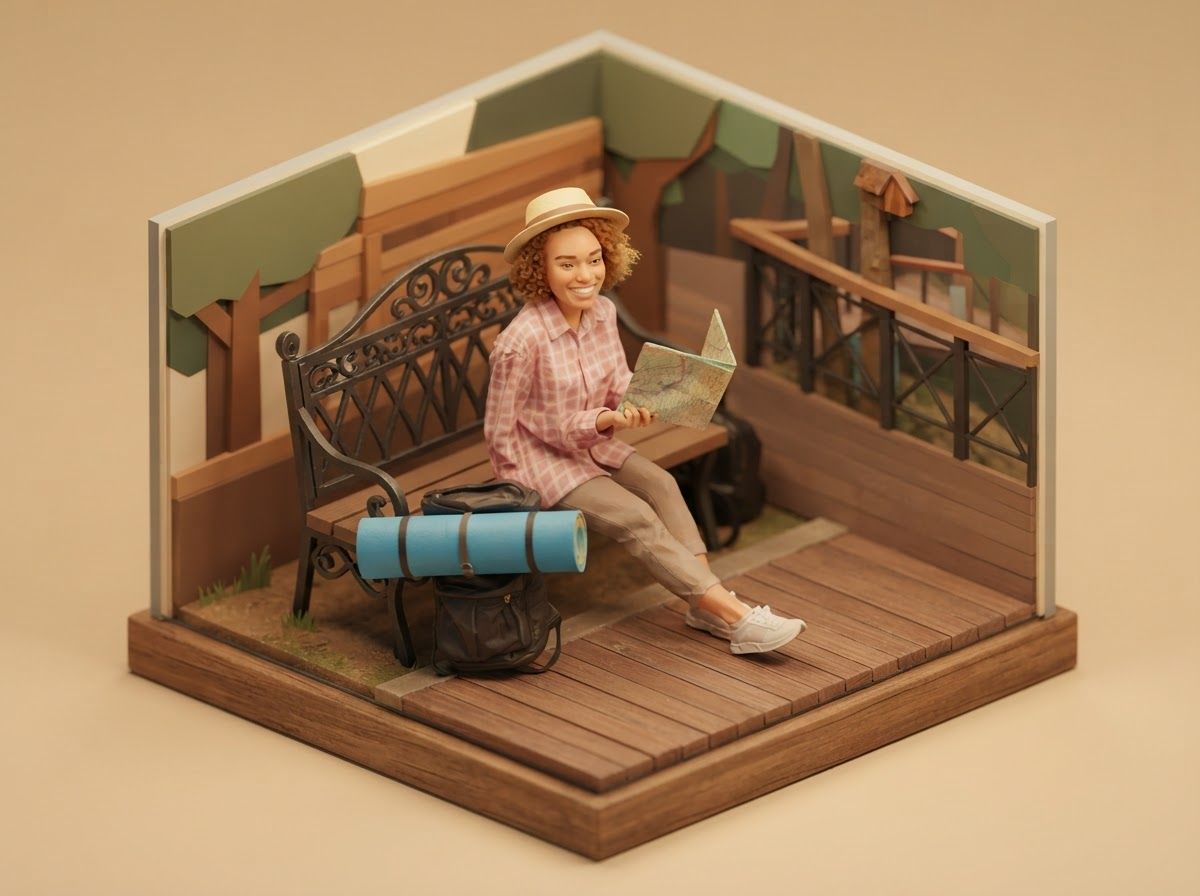
The best pick for spaces rather than people — a shop interior, an office, a property. Ideal source material for explainer graphics and website hero sections.
Convert this photo into a small isometric diorama illustration. Render it from a fixed 3/4 isometric angle with no perspective distortion, use clean simplified geometric shapes, soft ambient occlusion shadows where forms meet, a warm even light with no harsh shadows, and treat the whole scene like a tiny handcrafted model sitting in an empty white space.
16. Surrealist Dreamscape
The only prompt here that deliberately changes the scene. Cap it at one or two impossible elements — ask for more and the model starts inventing until nothing of your photo survives.
Reimagine this photo as a surrealist painting. Introduce one or two impossible dreamlike elements — a warped horizon, an object floating where it shouldn't, unexpected scale between foreground and background — use soft, even, slightly theatrical lighting, a muted symbolic color palette, and precise, realistic rendering of each individual element so the surrealism comes from the composition, not the technique.
17. Charcoal Sketch
Holds a likeness better than almost any other hand-drawn style, because the sharp linework stays concentrated around the eyes while everything else stays loose.
Turn this photo into a charcoal sketch on toned paper. Use soft smudged shading built up in layers, rough expressive strokes visible in the hair and clothing, sharper defined line work only around the eyes and key focal points, visible paper tooth texture showing through lighter areas, and white chalk highlights on the brightest planes of the face.
18. Low-Poly 3D
Clean enough to sit next to real UI. The varying facet size is the detail most people leave out — uniform triangles look like a filter, varied ones look designed.
Convert this photo into low-poly 3D art. Build the form from flat triangular facets of varying size (larger, simpler facets on flat areas like cheeks or clothing, smaller ones around detailed features), use subtle flat-shaded gradient lighting between adjacent polygons, a clean minimal color palette, and a simple gradient or solid background typical of modern low-poly digital art.
19. Vaporwave
Loud, dated on purpose, and very effective for music, nightlife and anything nostalgia-driven. The grid and gradient sky replace whatever background you had.
Restyle this photo in a vaporwave aesthetic. Use pastel pink-to-cyan gradients across the lighting, add a glowing retro perspective grid in the background fading into a gradient sky, subtle chromatic aberration and soft VHS-style glow, marble or classical-statue textures worked in if there's a plain background, and an overall nostalgic, slightly melancholic 1980s-digital mood.
20. Art Deco
Reads as premium without saying the word. Works especially well for hospitality, jewellery and real estate — the symmetry gives you a natural place to drop a logo.
Reimagine this photo in an Art Deco style. Use symmetrical geometric patterning radiating from the subject, sharp streamlined shapes with sunburst or chevron motifs, elegant metallic gold and black accent lines, a limited sophisticated palette (black, gold, cream, deep jewel tones), and the confident graphic flatness of a 1920s poster illustration.
21. Impressionist Painting
Outdoor and natural-light photos only. It builds form out of color rather than outlines, so indoor shots with flat lighting come back looking muddy.
Turn this photo into an impressionist painting. Use loose, visible individual brush dabs rather than blended strokes, build form through color contrast rather than hard outlines, soft natural outdoor lighting with dappled highlights, a bright airy palette with touches of unexpected color in the shadows (violet, blue), and let edges dissolve slightly into the background.
22. Graffiti Street Art
Replaces your background with a wall, so use it when the background was never the point. Strong for youth-facing campaigns and streetwear.
Convert this photo into graffiti street-art style. Use bold spray-paint texture with visible overspray and gradient fades, dripping paint edges on the bolder shapes, vivid clashing colors (neon orange against deep purple), a rough exposed-brick or concrete wall background with visible grime and old paint layers, and hard-edged stencil-style linework over the softer spray areas.
23. Papercut Layered Art
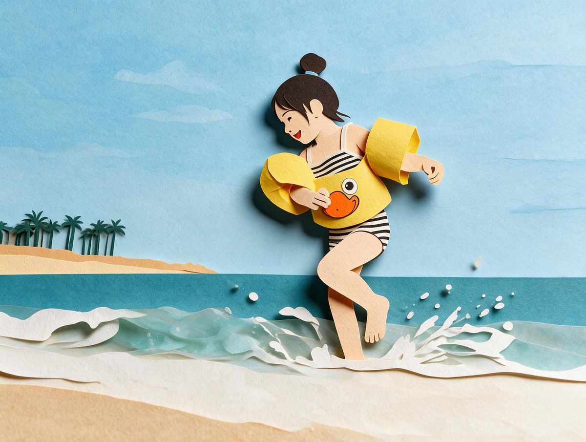
The depth layers make it easy to animate later — separate the layers in an editor and you have a parallax reel with no extra generation.
Restyle this photo as layered papercut art. Separate the image into 4–5 distinct depth layers, each a flat solid color of cut paper, with soft drop shadows cast between layers to create real depth, clean precise cut edges with no jagged lines, a limited complementary color palette, and subtle paper-grain texture visible on the topmost layer.
24. Knitted Yarn Plush
The "lumpy handmade proportions rather than perfect symmetry" line is what keeps it from looking like a 3D render of yarn. Pets and mascots convert beautifully.
Transform this photo into a knitted yarn plush-toy version. Give every surface a visible looped-yarn texture, use rounded, slightly lumpy handmade proportions rather than perfect symmetry, add visible stitched seams where pieces of the toy join, button-like eyes if there's a face, and warm, soft studio lighting that emphasizes the fuzzy yarn texture at the edges.
25. Retro Travel Poster
The only prompt here that leaves you deliberate empty space for typography. Best on a location shot — a skyline, a coastline, a building.
Reimagine this photo as a mid-century retro travel poster. Use flat bold color blocks with no gradients except in the sky, simplified stylized shapes that reduce detail to essential silhouettes, a warm sunset palette (burnt orange, teal, cream), a low, wide horizon line if there's a landscape element, and clean vintage sans-serif typography space left along the bottom or side as if for a destination name.
Tips for Better Results
Lock the composition before you do anything else. This is the single biggest difference between a styled version of your photo and a completely different photo in that style. Add "keep the subject, pose, framing and composition exactly as in the reference — apply the style only" to the end of every prompt. If the model still drifts, say it more bluntly: "do not redraw the subject."
Adjust intensity in plain language. If the effect lands too subtle or too aggressive, just say so in the next message: "make the pixel blocks larger," "reduce the halftone dot density," "less drip, more clean wash," "push the neon further." You don't need to rewrite the prompt — the model still has it in context.
Change one thing per round. Asking for warmer light, a tighter crop and heavier texture in one message usually gets you one of the three. Stack the corrections one at a time and you keep what was already working.
The source photo does half the work. A clear subject, decent light and an uncluttered background will beat a better prompt on a bad photo every time. Styles built on strong shapes — pop art, stained glass, papercut, low-poly — are the least forgiving, because there's nowhere for a messy background to hide.
Pick a style based on how much likeness you need to keep. Vintage film, charcoal, oil painting and watercolor preserve a recognizable face. Pixel art, low-poly, origami, papercut and knitted yarn deliberately abstract it. If the photo is of a client, a founder or a customer, stay in the first group.
Swap the palette for your brand. Most of these prompts name specific colors. Replace them with your own hex values or color names and the style survives intact — that's how a fun experiment becomes an on-brand campaign asset. Art Deco, origami, papercut and retro travel poster take brand colors best.
Stack styles in two passes, never one. Generate the ink line art first, then feed that result back in with the comic halftone prompt. Or run papercut, then apply the vintage film grain over it. Two sequential passes give you a layered look; one merged prompt gives you mush.
Regenerate before you keep editing. Three failed correction attempts on the same image usually means the model has locked onto a bad interpretation. Start a fresh generation with the same prompt — it's faster than arguing with it.
Where this actually gets used
Beyond the novelty of restyling your own photo, the practical version is running one campaign image through four or five of these and posting the set as a carousel — same product, five treatments, one shoot. Or picking a single style and applying it across an entire content calendar so the feed looks art-directed instead of assembled. The prompts are the cheap part; consistency is what people notice.
Save this page, try three styles on the same photo, and keep the one that made people ask which designer you used.
Quick summary · key points
- ✓How to use these prompts
- ✓1. Watercolor Illustration
- ✓2. Classical Oil Painting
- ✓3. Origami Paper Fold
- ✓4. Cyberpunk Neon
- ✓5. Studio-Ghibli-Inspired Anime